Home ReachFrom confusing journeys to clearer choices
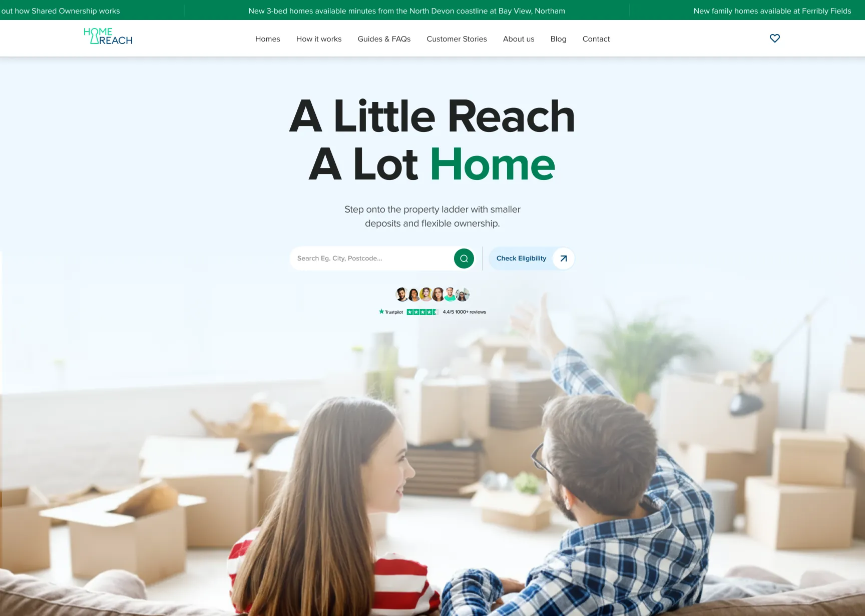
Home Reach wanted to make it easier for prospective buyers to understand Shared Ownership, find the right information and take the next step towards home ownership.
We worked across UX, design, development and website optimisation to simplify key journeys, improve property pages and make useful content easier to find. The work also addressed the technical and operational issues behind the experience, helping make the website easier to maintain and more reliable.
The challenge
Shared Ownership can be difficult for prospective buyers to navigate. People need to understand how it works, what they can afford, whether they're eligible and which properties are right for them.
Home Reach's existing website created friction in that journey. Navigation involved too many clicks, the proposition wasn't always clear enough, and parts of the interface felt dated or inconsistent across desktop and mobile.
The challenge was to make the experience clearer and more intuitive without disrupting the existing website, connected systems or customer journeys.
What we built
We used analytics, user behaviour, and Hotjar findings to identify where people were encountering friction and prioritise improvements.
The work included:
- Simplifying key journeys: reducing unnecessary navigation and creating clearer routes to property searches, eligibility information and enquiries.
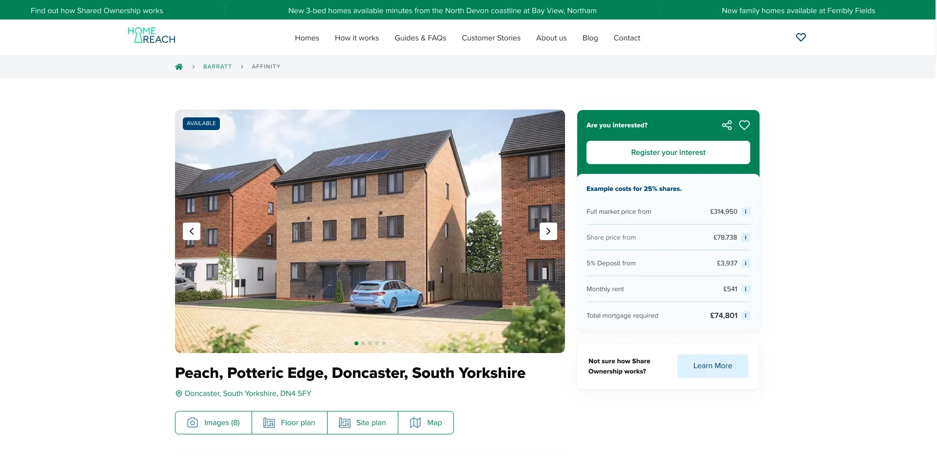
- Improving property pages: bringing important information, including pricing, share options, eligibility and enquiry calls to action, further into focus.
- Improving the mobile experience: making key information and next steps easier to access on smaller screens.
- Making the website easier to manage: improving CMS behaviour, property-status handling, redirects and error-page management to reduce manual intervention.
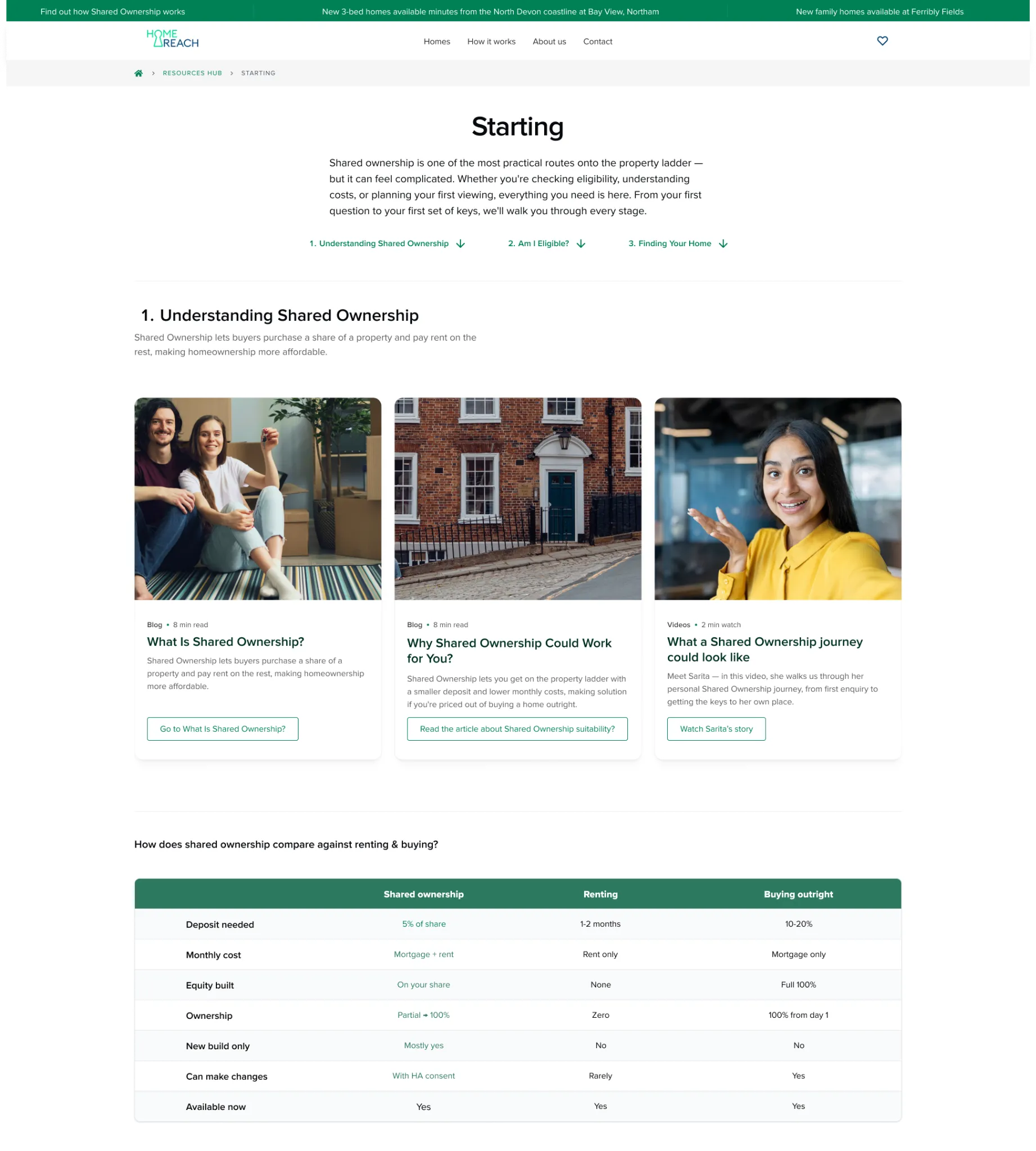
- Structuring useful content: developing dedicated areas for blogs, customer stories, webinars and events, and FAQs to help people find relevant information throughout their journey.
The work also accounted for the systems behind the experience, including Zoho forms, marketing consent, cookie consent, analytics and property data.
The impact
The work addressed friction across the customer journey, from understanding Shared Ownership to finding a property and making an enquiry. It also gave Home Reach clearer ways to organise and present useful content, alongside technical improvements to support day-to-day website management.
The approach was grounded in observed user behaviour rather than design assumptions alone, helping prioritise improvements around the information people need and the actions they want to take.
Why it matters
For shared-ownership providers, the website is more than a property showcase. It's where prospective buyers learn how the scheme works, assess their options and decide whether to take the next step.
A clearer digital experience can make that journey easier to navigate while giving marketing and sales teams a stronger foundation for attracting and converting prospective buyers.